Category Archives: Final_Data_Assignment

Hospital Wait Times

Share

For my data journalism piece, I was originally going to be doing a story on all the new red light cameras installed in Ottawa. Upon requesting the information, I could only be given the info for 2013 and 2014. I decided to change my subject to emergency room wait times in Ottawa in comparison to Ontario and Canada.


I was able to obtain the average hours it takes to see a doctor for an initial assessment. I was also about to obtain other info like doctors per capita, time to get a bed, funding information, demographics and more.


All around the country, hospitals have high emergency room wait times and Ottawa is no exception. The health district Ottawa belongs to, Champlain LHIN has higher wait times than the national and provincial average according to the Canadian institute for Health Information.   Although the wait times in Ottawa have diminished slightly in the past years, the wait time is still surprisingly high.


The average wait time to see a doctor for an initial assessment in 3.1 hours in Canada, 3.0 in Ontario and 3.4 in Ottawa. Meaning that on average you would be waiting about 30 minutes longer to see a doctor than you would be elsewhere in the country.


Champlain LHIN includes just over one million people, 15 per cent of which are seniors and 20 per cent of which live in a rural area. The district includes all of Ottawa’s hospitals along with hospitals as far as in Renfew and Barry’s Bay.


If we look at Ottawa’s hospitals individually, they are still over the national average. The hospital with the lowest wait time in Ottawa is the Ottawa Hospital General Campus. Its initial wait time is 3.2 hours. The lonest wait time in Ottawa would be at the Montfort Hospital, where the average wait time is 6.4 hours.


What could be to blame for these long wait times aside from the lack of funding would be the lack of doctors. Ottawa only has 140 doctors per 100,000 people. This means, that for each doctor there are over 700 people. If we look at Toronto, they have 184 doctors per 100,000.


I was also able to obtain data from the government of Ontario on when wait times were worst in the year and in the week by time slot. This allowed me to pin point the times that were worst.


Overall I was able to find the best and worst times to be sick.


The best would be on a Sunday morning in June where you would visit the Ottawa Hospital General Campus. The worst scenario would be being sick on a Friday night in January and visiting Montfort hospital.

OTTAWA WAIT TIMES


Best and Worst Road Conditions by Ward

Share

Worst roadways by ward 2012

Sean Minaker

15/12/2015

I was looking to find the worst roadways by ward in Ottawa. One way I decided was to access roadway calls to Ottawa 311 service requests for roads and work out what percentage of calls came from which ward.

The zipped CSV file came broken down into four quarters. I eliminated unnecessary data by filtering, added the quarterly totals and calculated which percentage of calls for maintenance came from which ward.

In the Excel file Q1-Q4 has a breakdown of calls by quarter, the page totals and percents has the summation of calls by ward and percentage by ward of the annual total.

Ward 6 Kanata/Stittsville had the lowest percentage of calls by over half of the top ward at 1.91 per cent. Although they have the lowest this could easily be due to the newer infrastructure of the area.

Ward 19 had the highest number of roadway calls at 5.96 per cent of the annual total. The high traffic area of the centre town core could easily attribute to wear and tear of maintenance.

There was a deviation in the study of 0.31 per cent due to calls made to no specified ward.

Graph showing calls by ward for 2012: Fixed Roadways-by-Ward (4)

Research workbook in Excel: Workbook-Final-Data-research-Project-2012 (3)


Profit or Altruism: A look at a private lending forum

Share

I have analysed a breakdown of all of the loans, repaid and not, from the subreddit r/borrow. R/borrow is a private lending forum where people can ask for a specific amount to borrow from another person participating in the community. They describe themselves as:


/r/Borrow is a subreddit aimed at helping individuals in the Reddit Community who are in a dire need of monetary assistance and will be able to pay it back in a short period.”


I feel this is such a unique element of human interest –especially around Christmas. I have a number of questions I feel are due for analysis:

How much money has moved on this service?

How much money is paid back?

Who uses this service the most? Do they repay consistently?

How many times are loans brokered on the service?

How successful does the entire operation seem to be?

Are the lenders working from a place of altruism or do they get something in the end?


rborrowchart2And to this they are quite successful. As of Dec 16 there has been 4557 transactions to total $908988.89 lent. Of which $610405.42 has been paid back. 67%! Since this is almost completely based on the honour system, having over a 50 per cent rate of return on investments means that the community should keep growing.


The growth is evident over the duration for how long the forum has been in operation. r:borrowchart1While not achieving positive growth every month, the roughly 200 transactions of the first month in service has doubled to over 400 during the month Nov 2015. The amount of lending has also generally increased with December 2015 being on track to potentially break $100,000 in a single month.


I have also determined that the vast majority of borrowers and lenders have done so only once, there are a number of generous souls. One individual has lent over 500 times. On the flip side, there are many one time borrowers but there are a number that have consistently used the service.


rborrowchart3It doesn’t look like abuse is prevalent. The most extensive borrower is identified as borrower_id 265. They have borrowed $5871.20 and repaid $3971.20 with over 50 loans. This person does not hold a perfect record, but it’s clear they are making the effort to repay their benefactors.


One untracked statistic is the rate at which lenders are paid interest. Usually the loan is for an even amount, say $500. What is then committed to is repayment which adds $25 to $100 dollars on top of the initial borrowed amount. This begs the questions if there’s money to be made here. The answer seems to be: potentially.


If you were able to do ten $100 loans and received $110 each time, you’d have a 10% return on your investment. Not bad for free money, but the downfall would occur when only a single person ends up not repaying you. All potential return is lost.


I have learned from the developer who has accrued this data that, probably due to tax reasons, the lenders do not wish interest information revealed.


With all of this fairly basic info, I feel I can make a call that the people who are lending are trying to help out of the goodness of their hearts. There’s no humongous guarantee your money will be returned but there is a steady growth of lenders and borrowers.


All of the individuals are anonymous for privacy reasons.

Ontario Pipeline Accidents & Incidents

Share

The construction of oil pipelines in Canada is a contentious issue. Proponents want Alberta’s crude oil shipped to markets elsewhere in the country. Opponents disapprove of pipelines and advocate for clean energy.

However my analysis of federal government data shows pipeline accidents and incidents have been on the rise in Ontario, where TransCanada wants to build a new pipeline Energy East. This pipeline would send crude oil from the Prairies to Eastern Canada.

ONTARIO

This data shows that Ontario oil pipeline accidents and incidents peaked at 25 in 2009. It has remained high above 20 per year since. (While 2013 is an exception to the rule, 2015 is low because the data is incomplete.)

Tim Duboyce, senior communications specialist for TransCanada, ensures there is no need for residents to worry about pipeline spills.

“In case of an emergency,” he said, “we’re literally six mouse clicks away from shutting the pipeline down. There’s a culture of prudence. If we think there’s a problem, we shut it down.”

According to this dataset, TransCanada accounts for 112 of the 195 total accidents in Ontario since 2004. The next highest is Enbridge with 50 reported accidents.

Trans Canada

Ecology Ottawa volunteer Mike Fletcher is opposed to the construction of new pipelines. “Whenever Trans Canada has held an event close to us,” he said, “I’ve been involved one way or another.”

The apparent rise in pipeline accidents and incidents in Ontario validates many of the concerns of groups like Fletcher’s.

According to the data, however, there have only been eight accidents or incidents that resulted in “environmental damage” nationwide since 2004.

I sorted and filtered the data in Excel to draw these conclusions. The charts and graphs featured above were also made with the data processed in Excel.

According to the TSB dataset, “accidents” or “incidents” occur at the following locations: compressor stations, gas-processing plants, line pipes, meter stations and pump stations. The nature of these incidents varies from fires and explosions to “uncontained releases.” (As far as I am concerned, this term is jargon for an oil spill or a gas leak.)

I used data collected and published by the Transportation Safety Board of Canada (TSB) earlier this year as part of its Pipeline Occurrence Database System (PODS). The data includes accidents and incidents reported to the TSB from January 2004 to present. Data is updated on the fifteenth day of every month, and this particular dataset includes incidents as recent as October 2015.

The federal government’s open data website issues a disclaimer that the oldest data is the most reliable, and that the most recent information may not have been confirmed and is therefore subject to change.

311 Data – Noise complaints and Organics Complaints

Share

For my final data journalism analysis piece, I decided to look at the wards most affected by prominent complaints in bylaw services and solid waste collection. I focused on noise complaints and organics, respectively.

First, I’ll discuss how I got my data. Since we were already working with the Ottawa 311 data, I exported results of the 2013 and 2014 fiscal years from MySQL into a CSV file and put that onto a master sheet on Excel. Excel doesn’t confuse me as much, which helped. I would have done the same for the 2015 data but I noticed inconsistencies with the noise results so I went to the City of Ottawa open data and downloaded the 311 data by month individually, January to September, and put all of that on a master spreadsheet.

Noise complaints were at their most prominent in 2013, where it garnered 12,312 calls in the fiscal year. In 2013, the most prominently noisy ward was Rideau-Vanier with 2,607 complaints. Councillor Mathieu Fleury attributed this to the ByWard Market and the University of Ottawa, since they are so busy. The Somerset ward came in second with 1,612 complaints and the Capital ward in third place with 1,020 complaints. The “quietest” ward was Osgoode, with only 68 complaints throughout the year.

From January 2013 to September 2015, there were a total of 30,789 complaints. 6,507 of those complaints were from the Rideau-Vanier ward, about 21.1 per cent. This means that, roughly, one of five noise complaints came from Ward 12. The next highest number of complaints, Somerset with 4,262 complaints over the time frame, accounts for 13.8 per cent of the total complaints. Though, the data does suggest there are less complaints in the Rideau-Vanier ward – as the amount of phone calls dropped roughly 16 per cent in 2014 from the year before, which a matter of about 424 less phone calls. Here’s a visual:

Consistently throughout the years, Rideau-Vanier, Somerset and Capital wards have been the Top 3. And in 2013 and 2014, the quietest ward has been Osgoode. But in 2015 thus far, the quietest ward has been Ward 5, West Carleton-March with only 57 calls so far this year.

So Osgoode has been on the rise, with 68 complaints in 2013, 83 complaints in 2014 and 93 complaints in 2015 with three months still to go. While it’s surely miniscule (as the 244 total complaints only account for 0.0079 per cent of the total noise complaints over 2013 to September 2015), it’s something to keep an eye on as it is no longer the quietest ward. Here’s a visual: Osgoode by year, noise

Also, in the last three months of 2013, there were 14 noise complaints and there were 23 noise complaints in the last three months of 2014 for Osgoode. This suggests a 61 per cent increase, and seems to suggest there will be 37 more complaints by the end of 2015, meaning that the number of noise complaints for Osgoode could be around 130.

While noise complaints are a pressing matter in the crowded, downtown areas like Rideau-Vanier and Somerset, organics in solid waste collection garners the most complaints and phone calls in suburban areas like Barrhaven, Capital ward and Kitchissippi. These wards vie for the most complaints a bit more so than the lop-sided noise complaints of the Rideau-Vanier area. This is because Barrhaven accounts for 7.7 per cent of the total calls, while Capital ward and Kitchissippi both account for approximately 6.6 per cent. Here’s a pie chart to show how close everything is:

2013-2015 organics complaints

I chose organics because it is a growing problem in terms of complaints, as in 2013 there were 10,526 complaints, in 2014 there were 12,653 and this year, there have been 11,758 complaints. That number is about 1,500 complaints above the same point of complaints circa Sept. 30, 2014.

One interesting trend is the rise of the complaints in the Orleans ward. In 2013, the ward had the 11th most complaints with 426. In 2014, it jumped to 5th most complaints with 678 – and has maintained the trend this year, where it now stands in 5th place at 732 complaints. Here’s a bar graph to show the trend:

Organics 2013-2015, Orleans

In conclusion, it appears that organics is rising in the amount of complaints and the noise is getting a bit more under control.

Sources: http://ottawa.ctvnews.ca/what-s-all-the-noise-a-ward-by-ward-breakdown-of-noise-complaints-in-ottawa-1.2431535

http://data.ottawa.ca/group/demographics


Homelessness in Ottawa Tanya Molloy

Share

Data Story

Dec. 17, 2015

Tanya Molloy

Homelessness in Ottawa

By studying the data on homelessness in Ottawa, organized and archived by the Alliance to End Homelessness Ottawa, one of the main key points that can be studied is the fact that homelessness itself, in Ottawa, is decreasing, whilst the average stay in shelters per night is increasing. It can also be studied that families stay in homeless shelters increasingly longer than men, women, and youth. Youth tends to spend the least amount of time in shelters.

number ppl using shelters during year

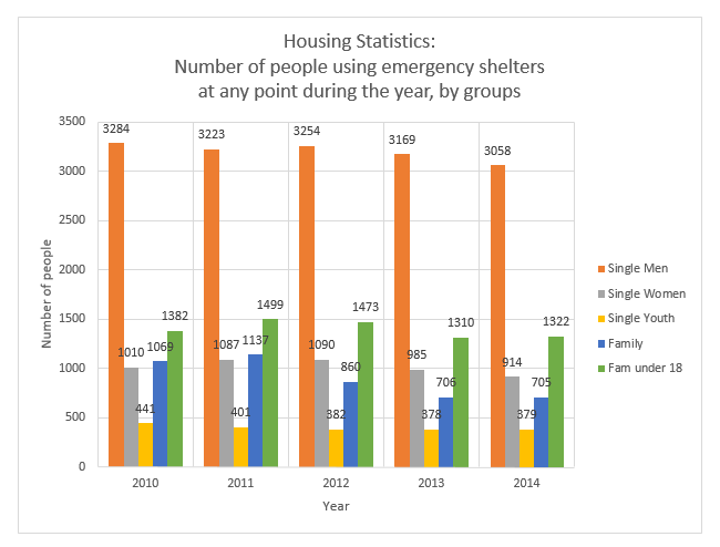
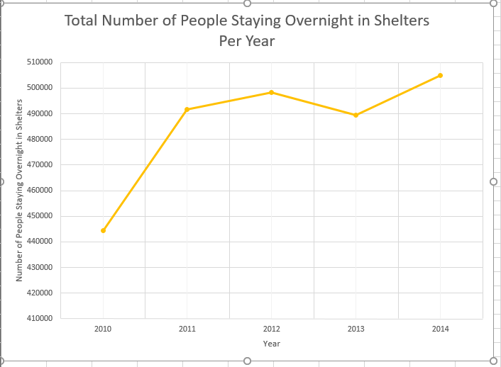
Tim Simboli is the chair of the not-for-profit alliance, and although he has seen signs of improvement for homelessness in Ottawa, a decade after his organization has started collecting data around homelessness in the city, is still not satisfied with the fact that the average length of stay in shelters in continuously going up since 2012, despite the total of homeless persons decreasing each year. Shelters were used by 6,520 people in 2014, which is 175 less than the year before, or a 2.6 per cent decrease.

lolollololollolol

However, there are more single homeless men than any other categories, including elderly people. Why? According to the Canadian Health Association, men are twice as likely than women to suffer from a mental disability, such as depression, bi-polarity, Alzheimer’s, etc. This would also explain why the second largest group to suffer from homelessness is the elderly, as people often begin to suffer from mental disabilities as they age. It has been proven that people who suffer from mental disabilities, and do not follow a strict treatment, are more likely to end up homeless.

number nights spent in shelter per year

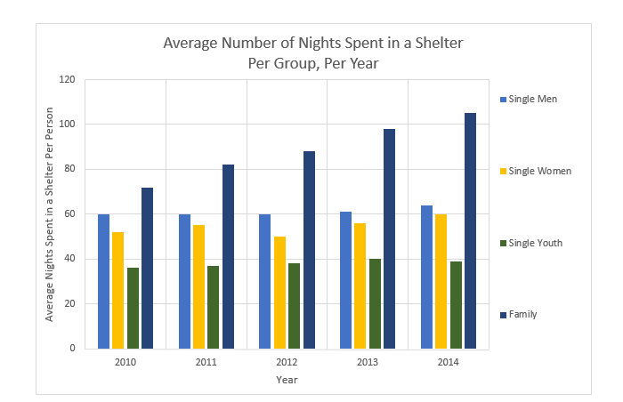
As well, the average length of stay can be related to the fact that there is a very high demand for affordable housing, yet not enough accommodations as such. There is an extreme shortage of affordable housing and rentals throughout Ottawa, especially for families who are in need of larger spaces, and elderly people (60+) who require special accommodations (wheel chair access, at home nursing, etc.).

wait list

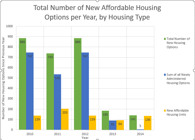
Continuing to study the affordable housing data, we can observe that the number of affordable housing in Ottawa is on the decrease since 2012. Every year, less and less housing is made affordable, yet the rent of regular places continues to rise. Both Mayor Jim Watson and Rick Chiarelli, councilor for the college ward, agree that there is a lack of affordable housing for low-income families and students, yet don’t seem to be putting much work into finding solutions. Not to mention that the government does not keep tabs on homelessness, and neither does Statistics Canada.

types of housing

By studying the affordability data, we can see that the lowest source of income comes from people on the Ontario Works program. This is a social assistance program. If you are in temporary financial need, the Ontario Works program can provide you with money and help you find a job. However, Ontario works does not provide nearly enough income for someone to pay for the average rent of a bachelor in the city, which is an average price of 780, an increase of 65$, since 2010.

A person on the Ontario Works program, living in the average bachelor and receiving the average of 656$, would be missing 124$ each month in order to cover the rent. And that does not include anything else the person needs, like food, supplies, etc.

Meanwhile, a person on ODSP, Ontario disability support program, in place for people who are disabled and unable to work, would be receiving 1098$ a month, leaving them with 318$ to use each month.

Finally, a person making the minimum wage, working the average of 40 hours a week, every week of the month (160 hours per month), would be receiving 1760$, leaving them with 980$ to use after paying the rent.

income vs rent

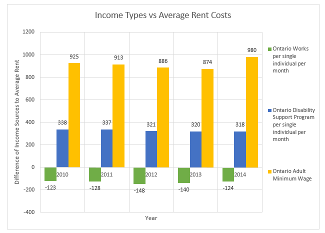
By studying this data, we can see that someone on Ontario Works could technically be forced into homelessness, if they do not find a job within the first three months of staying in the average bachelor apartment in Ottawa, since there is not nearly enough affordable housing, and the numbers are decreasing each year, for everyone already on the waiting list.

total new homes

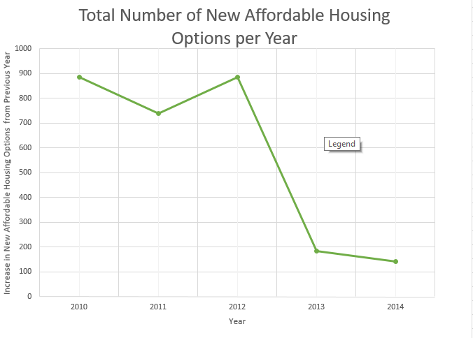
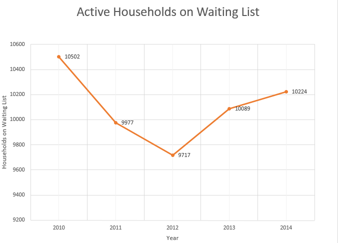
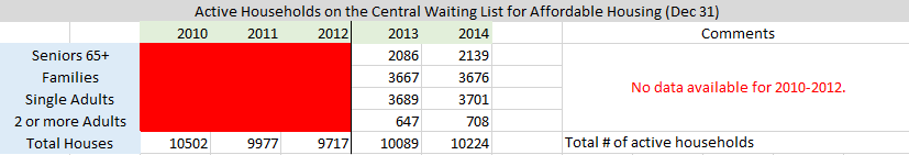
Finally, by studying the data of active households on waiting list for affordable housing, we can see that the number of people in need of low-priced housing has been increasing since 2012, whilst the earlier data of affordable housing options shows that the number of available housing is on the decrease. This will only increase the number of people on the waiting list in years to come if Ottawa does not find a way to create more supply for the demand.

waittttttttttttttttt

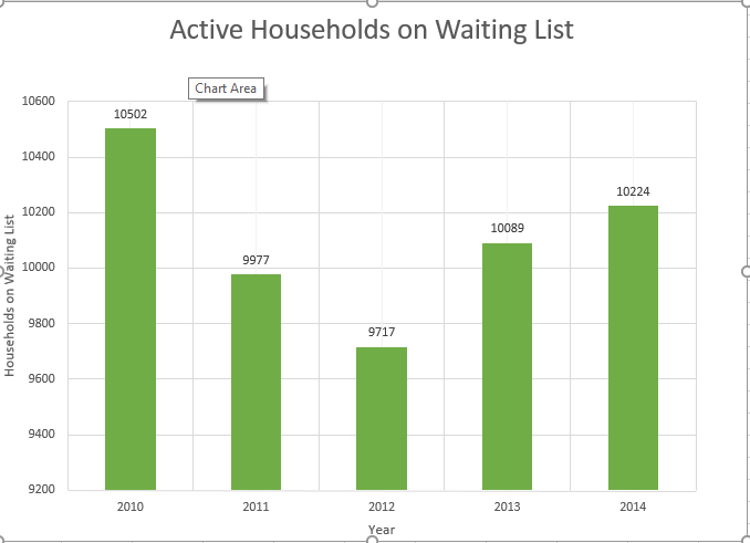
*Disclaimer: It is important to note that in the housing affordability section of the Excel document, under new affordable housing, I had to make a lump sum of new rent supplements, new housing allowances, and other subsidies, in order to calculate the graphs used, since the 2010 and the 2011 data did not separate the values per group. As well, the data showed that there was no longer any funding of other subsidies after 2012. Finally, the data did separate the active households on waiting lists per group until 2013, and so I was unable to make the graphs per group. Instead, only the total number of households was used to compare the data.

Screenshot_1

Youth Voting Turnout

Share

I took a look at the extent of the youth voter turnout problem in the federal elections between 2004-2011 (as we all know, there were, amazingly, four total in just those eight years).

Note: The full Elections Canada dataset from the October 2015 election is not available yet.

A very brief overview of the history: We saw a spike in overall voter turnout in 2006 in response to the dissolution of Parliament due to the Paul Martin corruption scandal, from 60.9 per cent turnout in 2004 to a 64.7 per cent turnout in 2006, with the youth vote (persons aged 18-24) increasing by a substantial 6.52 per cent. The third election in five years in 2008 seemed to quell the intermittent rise in enthusiasm as the 18-24 vote declined 6.4 per cent in 2008. There was a modest increase in 2011.

1824turnout

voterturnout

I sought to quantify the youth voting turnout in slightly different terms to better understand the extent of its underrepresentation among the voting public.

Below, a negative number shows “underrepresentation” – a positive number shows “overrepresentation” – among actual voters compared to the “elector pool” of eligible voters. Put simply, this is the percentage difference between how many people did vote and how many people could vote among the different age demographics.

shareofelectorvsshareofvote

Here is the raw data I pulled from various Elections Canada spreadsheets, along with my own calculations in the far right columns.

Screenshot 2015-12-17 19.48.00

By calculating the percentage of the total eligible voters belonging to each age demographic, we can also see evidence of how Canada’s aging population is affecting the political dynamic of the country. While the percentage of the total share of eligible voters has declined for every age group between 18-44, the share of eligible voters belonging to the 44-74 age groups is expanding.

shareofeligiblevote

This accentuates the need for young Canadians to understand how their turnout at the ballot box will only continue to grow in importance.

The most dedicated voting block has been the 65-74 demographic over the last four federal elections, and the portion of the Canadian population over the age of 65 is rapidly expanding as the youngest generation of baby boomers will be 65 by 2031. It is expected that the percentage of the Canadian population aged 65 or older come 2036 will be around 24%, compared to just 14% in 2009 — a 10% increase in a 17-year period.

It is in no way overstating the analysis to say that, in the last four elections, the difference in turnout between citizens aged 65 or older and citizens between the ages of 20-34 has been vast. If this pattern holds, knowing the changing demographics of the country, the political voice of the youngest voting-eligible generation stands to become even more marginalized, and theoretically the issues facing the demographic will be even less relevant to politically-expedient members of Parliament.

The recent Liberal electoral victory has been partially attributed to an increased youth voter turnout based on the overall voter turnout increase and advanced voting numbers among students, but we will have to wait to see the true extent of the youth voting factor in the recent Liberal victory when Elections Canada makes the data available. It will also remain to be seen if the 2015 election momentum in this area will prove more sustainable than it has in the recent past.

Noise Complaints — Michael Miller

Share

I now know that the ward who receives the most noise complaints (at least in the year 2015), is Ward 12 or Rideau-Vanier. After acquiring the 311 service requests data from data.ottawa.ca, I downloaded the values for the first nine months of the year, January to September. I then used a pivot table for each month’s file, sorting the rows by ward and the values by the number of complaints received. After the pivot table was created, I took each table and put them into one document. Next, I added up all the values for each month by ward and sorted them into a final table of their own, adding the total number of noise complaint calls together. Finally, I used rapidtables.com to pull my findings up on a bar graph to better represent the data.

The total number of 311 calls regarding noise amounted to 8106 for the first nine months of the year. Rideau-Vanier took the crown with 1717 complaints, with Somerset ward coming in at 1172.

Ward_# Total_#_of_noise_complaints_Jan-Sept_2015
1 177
2 143
3 287
4 127
5 57
6 117
7 309
8 409
9 259
10 266
11 246
12 1717
13 444
14 1172
15 389
16 455
17 535
18 280
19 159
20 93
21 96
22 156
23 213
TOTAL 8061

Violence Against Women

Share

All of my data on the topic came from Stats Canada’s 2013 survey on family and intimate partner violence. I wanted to find is how much of the family violence is spousal as opposed to violence that is directed towards other family members, what percentage of family violence is directed towards women, both as the spouse and other female family members, and how might the rate of intimate partner violence change with different age groups.

I took a chart that had selected police reported instances of family violence from 2009 to 2013. Violations could be directed at spouses or other family members. The chart was not broken down by age so other family members could be children or extended family. The chart also did not separate gender either. Types of violations included violations causing death, attempted murder, physical assault and sexual assault. In total there were 75,185 violations with 37,828 of those being directed at the spouse. Of the violations against spouses 36,877 were cases of physical assault. 49 per cent of all instances of family violence was directed towards the spouse.

http://www.statcan.gc.ca/pub/85-002-x/2014001/article/14114/tbl/tbl15-eng.htm

To find how much of the violence against spouses is against women I turned to a chart of police reported intimate partner violence by metro from 2013. There were 32 metro areas in the chart with two of them being Toronto and Ottawa. Next I added all incidents to see how many there were in total. There were 60,101 incidents that year with 79 per cent of incidents being directed against women and 24 per cent being towards men. When isolating Ottawa, the percentage of violations increases to 84 per cent compared to other metro areas. This is a rise of 5 per cent above the national average.Men vs Women Breakdown

http://www.statcan.gc.ca/pub/85-002-x/2014001/article/14114/tbl/tbl12-eng.htm

Finally I took statistics from victims of police-reported dating violence, by age group and sex of victim in 2010 and victims of police-reported spousal violence, by age group and sex of victim. The results virtually mirrored each other. For spousal assault the age range 15-24 the percentage of violence against women was 89 per cent. For the 25-34 it was 83 per cent, for 35-44, the percentage fell to 79 per cent. As the ages went up, the differences between men and women began to shrink. It was 74 per cent from 45-54, 72 per cent from 55-64 and 73 per cent for those over 65.

http://www.statcan.gc.ca/pub/85-002-x/2012001/article/11643/tbl/tbl2-2-eng.htm

Violence Dating

For dating violence the number dropped from 85 per cent between 15-24, to 78 per cent between 25-34, 74 per cent for 35- 44, 71 per cent from 45-54, 60 percent for 45-54 and 56 percent for 55-65 and 65 plus respectively. Ultimately dating violence against women was 75 per cent while spousal violence was 80.

http://www.statcan.gc.ca/pub/85-002-x/2012001/article/11643/tbl/tbl2-3-eng.htm

VIolence Spouses

Ottawa councillor campaign donations

Share

Campaign fundraising is the ugly side of politics that no one likes to acknowledge. Whether it is federal, provincial or municipal politics, they all have to fundraise.

That money is spent on lawnsigns, staff and everything that goes into a campaign for public office. The average donation total for a councilor elected in the 2014 Ottawa municipal election was $26,545. The councilors elected also averaged $10,192 in corporate/union donations, a type of donation which is banned in the city of Toronto.

OttWatch has compiled all donation records dating back to the 2004 election in Ottawa.

The most money raised in the 2014 election was $40,000 by Cumberland ward councilor Stephen Blais. The least amount was $4,000 by Captial ward councilor David Chernushenko.