Category Archives: Algonquin Assignment

Smog Advisories in Ottawa and why they’ve disappeared

Share

For my data story I chose to write about the smog advisories (or lack of) in Ottawa over the past couple years and the main factors behind this. I found my data on Ontario’s Ministry of the Environment and Climate Change website, specifically where the Ottawa Downtown Air Monitoring Station data is kept. I used data sets that detailed where all the air monitoring stations in Ontario are located, how many smog advisories have been issued from 2003-2015, how long these advisories lasted and the measurements of fine particulate matter which is a major factor in smog levels.

Data project


Noise Complaints in Ottawa

Share

Create free infographics with Venngage

First thing I did was find the data. I started with the NoiseComplaintsInWardsForFT.csv file we were provided with to see which ward had the most noise complaints, as I wanted to focus on that and find any trends associated with the particular ward. Based on the first step of analysis, done by making the above cloud bubble graph venngage.com, I was able to discover that Ward 12, Rideau-Vanier, has the most complaints, overall, from January 2013 – September 2015.

From there I focused on Ward 12. I found a map of all the wards in the city and one of ward 12 on it’s own, so I could see the location and what sort of businesses and  In order to provide myself with some focus for my story, I contacted the Rideau-Vanier’s Ward Councillor and his assistant, Stephane Galipeau, was very helpful. He told me that the complaints usually go down during the winter but when they start to pick up varies on the weather changing from winter to spring. I decided to take the data from January, March and July 2013-2015 to see if there is a trend in noise complaints, with them being lower during the winter months, increasing in the spring and peaking in the summer.

Finding the data proved quite easy through http://data.ottawa.ca/, since all noise complaints go though the 3-1-1 bylaw hotline. By searching the 3-1-1 service data, I was able to find .xslx files segregated by year and then by month, each with their own file. I then downloaded the files from January, March and July 2013-2014 and put them into excel. For each file, I started with the original file and deleted the unnecessary columns to make it easier to filter and find the information I required. Then I created a pivot table for each file, filtering to see how many noise complaints were made in ward 12 in that month/year.

Next, I went back to venngage to complete my infographic and made the above bar graph depicting the noise complaints in January, March and April, grouped by year. I noticed that the number of complaints peak in July, as predicted, but was surprised by the amount of noise complaints made in January. Galipeau was very insistent that there are always more complaints in the warmer months, so I went about finding someone who could give me some insight as to why January has more complaints than a warmer month like March.

I found my answer with City of Ottawa employee, Shannon White. I gave her the data I found and questioned her about the large number of complaints made in January and she told me that number didn’t surprise her at all. She said that since they have to remove the snow as it falls, they can’t wait until business hours. This is especially the case in a ward like Rideau-Vanier, because it has major downtown businesses, the University of Ottawa and some of the most narrow streets in the city (complete with the need for street parking).

As much as the data shows that the number of noise complaints in ward 12 are decreasing, I think we will continue to see numbers in the same range due to unavoidable noisy actions, such as snow removal and construction.

Sources:

http://ottawa.ca/en/city-hall/your-city-government/city-wards

http://data.ottawa.ca/en/dataset/311-monthly-service-request-submissions

http://data.ottawa.ca/en/dataset/2014-311-monthly-service-request-submissions

http://data.ottawa.ca/en/dataset/2015-311-monthly-service-request-submissions

https://infograph.venngage.com/infographics

Can we save money by going online? Cynthia C

Share


Algonquin is required to pay the Ontario Stewardship Program fees to recycle paper publications. Can we save money by going online?


The Ontario Stewardship Program reports on the amount of waste material produced by Algonquin (paper publications such as the Oncourse catalogue, the Viewbook of courses, Algonquin Times, bond paper printing, etc.), plastic bags from Connections and plastic containers (HDPE) from the Marketplace cafeteria) that have the potential to end up in BlueBins in households and be recycled.

Algonquin pays a fee each year based upon the amount of waste/recyclables produced. All of the funds collected from the “producers” essentially pays for the running of the collection and recycling programs provided by the municipalities.
The program sets a standard estimate that a FTE (full time equivalent) student produces.

The rest is based on the weight of the printed material. Magazine style publications (classified under Viewbook) weigh the most because the paper is glossy and thicker.


Three Scenarios were provided to calculate the fees Algonquin would pay:

Scenario A – Viewbook uses the magazine rate

Scenario B – Viewbook uses the cheaper newsprint rate


I used another spreadsheet and created a third scenario to see what would happen if the publications went online instead:

Scenario C – Viewbook prints less by going online (an estimated rate).


The pie chart shows the majority of the cost goes to the magazine because of the weight and distribution.


The bar charts show the consistent decrease in cost when the cheaper rates are applied across the above scenarios.


The horizontal charts show that it would be cheaper to produce the magazines online and reduce recycling costs considerably.


The data shows that it is cheaper to go online rather than print. But the story begins there. How willing are people to give up print totally?

Public Skating in Ottawa

Share

Being the home of the Rideau Canal, Ottawa is very well equipped when it comes to options for public skating. However, conditions are’t always ideal for skating so I decided to see how people plan their outings while skating. I used data from the city of Ottawa website to see how many people were searching for info on public skating.

Visitor Traffic


The graph above shows hits on the city of Ottawa from people searching for public skating schedules and for the rink of dreams during the month of January. Given the warm weather this December, January seemed more appropriate. I used the data to show that people were not only actively looking for information about rinks, but they were looking for information about specific rinks.


Exit

I then checked the exit percentage on those websites to see who left the website on those pages. I’m assuming they left because they found what they were looking for, so I can infer they came to the website looking for information about skating.

Using this analysis I can inform my feature article and ask more specific questions about how people plan their skating excursions. By proving that using the internet in this way is actually thing, I leave the door open to examine other sources on the internet people use should I decide to revisit the issue.

A Inquiry into Algonquin’s Graduate-Employment Rate

Share

Algonquin is boasting a high graduate-employment rate of 90 per cent. But some graduates are wondering where those jobs are.

Algonquin’s graduate-employment reports are released annually as part of efforts to collect and report data from Ontario’s colleges. The school’s website still uses the 90 per cent rating despite the last two reports stating the percentage to have fallen to 85 over the past two years.

1. Student Response

Algonquin’s website lists the report as one of six different areas surveyed under the Key Performance Indicators (KPI) initiative, part of the Ministry of Training and Ontario’s colleges efforts to develop a process to obtain client feedback on post-secondary programs. However, the numbers can be misleading as a noticeable percentage of graduates do not respond to the survey.

For example, in Algonquin’s graduate-employment report of 2011-12, the number of graduates in the graphic design program was 67. The number of graduates who responded to the survey was 40, and the number of individuals employed in their field was 18. For some programs that have up to 80 graduates, the survey may only reach 40 or 50 of those graduates.

The response rate hasgraph3 held steadily around 60%  over the years. While this is a decent response, Algonquin’s Employment Support Centre is aiming for a better turnout. Currently, the survey is conducted by telephone, a method which Jennifer Jarvis, employment outreach officer, says is being looked into to see if alternatives are feasible and could produce a better response.


graph4graph5


graph6graph7

graph1

Response to the surveys appears to be on a slight decline over the last two years, and as of yet, Algonquin has yet to release its data for the years 2013-2014, and 2014-2015. Jarvis says that this is due to a delay in data processing.

2. Unrelated/ Related Work

The KPI surveys do, however, make the distinction between unrelated and related work and the above figures represent the difference in employment.

What the 85 per cent rate is based off of is the number of graduates who respond to the survey and answer that they are employed; it does not matter what field they are employed in.  Algonquin’s claim also does not take into consideration whether work is full time, part time, or contract work. The KPI surveys do, however, make the distinction between unrelated and related work and the above figures represent the difference in employment.

graph2

A more accurate employment rate: Up to 65% of grads find work in their field while 35% do not.

“The reports used to be mailed out to high schools in the Ottawa and surrounding area for guidance counsellors so that they could use it as a resource for students considering program areas, and what some of the outcomes were. So this is not the be all and end all, because it is just a survey. But it is an indication,” said Jarvis.  “The reports only reflect a fraction of the data.”

A 60% grad-employment rate for work in a related field is still a high percentage, but the 90% claim is certainly misleading for those selecting post-secondary institutions and basing their future success off this claim.


Final data assignment: Human interference with protected birds

Share

The data I obtained is the admittance database for injured and sick wild birds at the Wild Bird Care Centre. You can download the data here:  Wild Bird Care Centre Data. They have a pretty detailed admittance form which they input into excel. Some of the key fields I found gave interesting results were the “reasons for admittance”, whether the bird was protected under an “wildlife protection act”, and the “status” of the bird at admittance and its “final status”.

I had all of 2013, 2014 and up to mid November for 2015. I  removed all of the calculations and validation work going on in each cell by copying the table and pasting it in a new tab and keeping only the data and number format. I then cleaned up the data and kept only the columns that might be of interest.

All of my analysis was done using pivot tables and filtering. I was able to do a lot of interesting combinations, that showed that over 290 birds that are protected under the Migratory Bird Convention Act and the Species at Risk Act were the result of human interference, with cases such as poisoning, removing them from their environment, destroying the nest, feeding it an incorrect diet and keeping it as a pet.

There was a specific case that stood out where an individual had removed a species at risk — chimney swifts, a threatened species — from a site, illegally. The staff was able to comment on that, and the procedures for dealing with species at risk when someone violates a law. The Ministry of Natural Resources will investigate any cases where someone may have interfered with a species under one of these acts.

I found that approximately 10 per cent of the birds (721) that were brought in were a direct result of human interference, and out of that 40 per cent of them (291) were protected under on of the acts.

I used Plotly to make the data visualizations. The visualizations are pretty basic, but I like that plotly makes them interactive and visually clean and appealing.

I had no location data to map it out (I suggested to the staff to add a location feature to their data because it would be interesting to map the locations of found injured/sick birds).

I was also able to look at the sensitivity of different protected species, to see if their were some that were easier to rehabilitate than others, which ended up providing some color to the story, and to give people a perspective on the challenges of rehabilitating species that are highly sensitive when out of their regular environment.


Population changes in Ottawa

Share

The population of Ottawa is growing and according to the City of Ottawa Estimates, the nation’s capital has increased by approximately 30,000 citizens since 2011.

According to the estimates, the total population of the city of Ottawa was sitting at 927,119 residents in the end of 2011. In 2012 there were 935,073 projected residents, in 2013 there were 943,258, in 2014 an estimated 951,727 citizens, and in mid-2015 the number was 957,148.

With the exception of the mid-2015 data, there has been an increase of at least 7,950 residents in Ottawa each full year since 2011.

The year that has seen the largest population jump since 2011 was 2014. In 2014 alone the city increased by an estimated 8,469 residents.

The graph below shows the steady incline in population growth from 2011 to mid-2015. The data does tail for 2015, displaying that the population doesn’t increase as steadily, but that is because it was mid- year data for the year of 2015.

Click the graph to enlarge.
DataHero Total Population in Ottawa (2011-2015)

From 2011 there has been fluctuations within the populations of each ward. Each ward does not always see a steady increase, despite the fact the city’s overall population continually increases.

Below is a graph comparing the 2011 population to the 2015 population of each ward. Of the 23 wards within the city, Barrhaven currently has the most residents at an estimated amount of 57,159. The graph displays the most populated wards of 2015 starting from the left and it is organized in descending order.

Click the graph to enlarge.
DataHero Comparison of Ottawa ward population from 2011 to 2015 (1)

Even though Barrhaven presently has the highest population of the 23 wards, it is not the ward that has seen the highest increase in residents since 2011.

Below is a table that displays in descending order the wards that have increased the most in population since 2011 to mid-2015. Although Barrhaven has increased by approximately 15.01%, Gloucester South Nepean has grown the most, having increased by 18.62% since 2011.

This table shows that ten wards have decreased in population since 2011, while 13 have increased. The data is based off of the individual ward population estimates from 2011 and 2015 alone. The 2012-2014 population statistics were not taken into consideration as it is singularly a comparison from 2011-2015.

As an example, the population in Gloucester South Nepean was estimated to be 40,730 in 2011. In 2015 it was 48,315, having increased by 18.62% and approximately 7,585 citizens. This does not necessarily mean Gloucester South Nepean, Ward 22, saw the highest average increase, nor does it mean 18.62% was its optimal percentage increase from 2011 to 2015. It is simply the ward that has seen the highest increase in numbers based off the 2011 data compared to the mid-2015 data.

Click the table below to enlarge.
Wardgraph

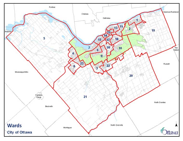
Below is an interactive map that allows you to click on each ward. It displays how many estimated residents the ward has lost or gained from 2011 to mid-2015. The wards unfortunately do not display their name, but instead their number.

As the legend indicates, the darker coloured wards have seen the higher increases since 2011 while the lighter coloured wards have seen a decrease. Based on the table above, Gloucester South Nepean saw an increase of 18.26% of the population and approximately 7,585 individuals while College ward saw a decrease of 2.43% of the population to result in a decline of an estimated 1,310 residents. Since Gloucester South Nepean had the highest percentage increase, and College ward had the highest percentage decrease, this explains the range of the map ‘s value in the legend.

Click to display each ward and its average increase or decrease of residents from 2011 to 2015.

Noise Complaints in Ottawa

Share

For my final data assignment, I decided to do it on noise complaints in the city. I live in a fairy isolated and suburban family neighborhood so I’ve been fortunate enough to never have to deal with noise complaints but always wondered about noise complaints in other parts of the city.

Before I could start this assignment I needed some data. Noise complaints go through bylaw services so to retrieve this information I needed to look at the city’s 311 data. To find this I went to http://data.ottawa.ca/ and searched for noise complaints. Immediately this brought up 311 calls by year and in each of those individual year tabs the data was separated by month with the type of calls made each month and at what time. But I only needed the data on noise complaints.

To start I downloaded the 311 data in excel sheet form from January 2015-September 2015. Then I went into each individual excel sheet and filtered the information to only show me noise complaints. After I filtered each month to see only the noise complaints I filtered and grouped the information by ward. This way I could easily see the amount of noise complaints were filed per ward. And I did this process to every month from January 2015- September 2015.

Once I filtered each of the months to only display noise complaints I added each of the wards noise complaints totals together and put them in a chart on meta-chart.com to show the total umber of calls by ward from January 2015-September 2015.

The result was:

meta-chart (3)

After I filtered the nine months of data for this year and put it in a chart  I quickly and easily noticed that every single month Ward 12, Rideau-Vanier, had the most amount of noise complaints, sometimes having more than double the amount then the other wards for that month. This raised my question of whether or not this was because the Rideau-Vanier ward is a very student populated area.

asdasdas
A map of ward 12. It may look large but really…


sadasds
It’s one of the smallest wards in Ottawa. Making it really interesting and intriguing that it has the most noise complaints of all of Ottawa.

I wanted to see if this was a noticeable trend so I looked at the data from June 2013-September 2013 and June 2014-September 2014 to see if this has been a reoccurring trend.

So I took one month from each year and put the data into bar graphs on meta-chart.com.

The results were:

meta-chart (2)

meta-chart (1)meta-chart


Looking at each of these graphs it is extremely obvious that ward 12, Rideau-Vanier has consistently had the most noise complaints each year. It is also easy to notice that Ward 14, Somerset had the second most noise complaint calls. But even being the ward with the second largest of calls it still didnt come remotely close to the large number of noise complaints made in the Rideau-Vanier ward.

Looking and comparing each of these charts its also easy to notice that while the noise complaints in Rideau-Vanier are always in the high 200’s they have been coming down each year. Showing that maybe the number of call complaints are having an imact on the noise residents make in the Rideau Vanier ward.

SOURCES

http://data.ottawa.ca/en/dataset/2014-311-monthly-service-request-submissions

http://data.ottawa.ca/en/dataset/311-monthly-service-request-submissions

http://data.ottawa.ca/en/dataset/2015-311-monthly-service-request-submissions

http://data.ottawa.ca/

http://ottawa.ca/en/city-hall/your-city-government/city-wards

https://www.meta-chart.com/bar